From Peter Gasston, the author of The Book of CSS3
1. Device-responsive pages
The big growth area of web browsing is on smartphone and tablet devices such as Android, iPhone and iPad. New media features and page layout modules in CSS3 let you make pages which respond to the capabilities of the device that's viewing them, automatically optimizing your content for multiple screen sizes and giving your visitors a tailored experience.
2. Eye candy!
CSS3 brings web documents to life without complicated JavaScript. Rotate, scale and skew page elements in both two and three dimensions, add smooth transitional animations to elements when their values change, and go even further with keyframe animations which give you fine control over the behavior of your page elements.
3. A better reading experience
The Web was made for reading text, but for years we've had to use a handful of fonts in a very conservative way. CSS3 brings the power to use any font you wish, to decorate the text with drop shadows and outlining, plus new ways of laying out the text such as in multiple columns, like a newspaper or magazine.

4. Easier to maintain
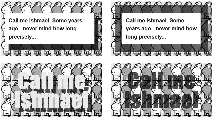
Using CSS2.1 usually means adding images (and extra markup) to your documents in order to achieve what should be simple effects. Something as basic as adding rounded corners to an element can mean using up to four extra empty elements to accommodate the graphics required to fake the appearance. CSS3 was created to address just these problems, so you can add rounded corners, drop shadows, gradient backgrounds and much more without writing unnecessary markup or creating multiple image files - meaning a lot less work to make and maintain your documents.
5. Cleaner code
The greatly expanded range of selectors in CSS3 means you can add special formatting to links depending on their destination, loop through long tables and lists, even select form elements depending on their current state - all without having to clutter your code with surplus class attributes.
